Top 10 Now 40–41%: Monitor S&P 500 Concentration and AI Megacaps
By MarketCapLens · Published · 8 min read

The 10 largest companies in the S&P 500 now account for roughly 40% to 41% of the index’s total market value, well above the ~27% dot-com peak in 2000. Nvidia, Apple, Microsoft, Amazon, and Alphabet anchor that group, riding an AI-driven earnings narrative that has outpaced their actual share of index profits. If you own an S&P 500 fund, you’re carrying a bigger concentrated bet than at any point in the index’s modern history, and it’s worth reassessing what “diversified” actually means in your portfolio right now.
TL;DR:
- The top 10 companies now account for nearly 41% of the S&P 500’s total value, much higher than the 27% peak during the dot-com bubble in 2000.
- Mega-cap stocks like Nvidia, Apple, and Microsoft often make up over 25% of the index, driven by AI infrastructure spending and passive fund inflows.
- The concentration is evolving from a historical pattern, with recent surge powered by structural forces such as buybacks, digital scaling, and thematic capital chasing AI dominance.
- Increasing index concentration enhances risks from single-company shocks, reduces diversification benefits, and makes index performance more dependent on a few mega-cap firms.
- Investors can mitigate concentration risks using alternative ETFs, tactical sector tilts, periodic rebalancing, or monitoring top holdings with specific metrics to avoid being overly exposed to a handful of stocks.
Table of Contents
- How concentrated is the S&P 500 right now?
- How did S&P 500 concentration evolve from 1990 to today?
- What is driving the concentration in mega-cap stocks?
- What are the risks of a concentrated S&P 500?
- Cap-weighted vs. equal-weighted S&P 500: what’s the performance gap?
- How can investors manage S&P 500 concentration risk?
- How do you measure S&P 500 concentration yourself?
- How MarketCapLens tracks S&P 500 concentration
- The bottom line on S&P 500 concentration
- Our take: why we watch weight, not headlines
- Sources
How concentrated is the S&P 500 right now?
The numbers are stark. RBC Wealth Management has dubbed this shift the “Great Narrowing,” pointing out that by the end of 2025, the top 10 holdings represented nearly 41% of the index’s weight, a figure that has continued to hold through 2026. The top 20 names push that share meaningfully higher still, and information technology combined with communication services now makes up close to half of total index weight, based on S&P Global’s own sector breakdowns.
Pull up the SPDR S&P 500 ETF Trust (SPY) holdings and the pattern is immediate:
- Nvidia (NVDA) and Apple (AAPL) typically trade the top two spots depending on the week’s price action
- Microsoft (MSFT) sits close behind as a consistent top-three holding
- Amazon (AMZN) and Alphabet (GOOGL) round out the next tier of mega-cap weight
- Combined, these five names alone often exceed 25% of the entire index
One detail investors miss: weight and earnings are drifting apart. That gap is the difference between a value-supported rally and a narrative-supported one.
How did S&P 500 concentration evolve from 1990 to today?
Concentration is not a new phenomenon in the index. What’s different this time is the scale and the source.
- 1990: The top 10 holdings made up a modest single-digit-to-low-teens share of the index, dominated by diversified industrials and consumer names
- 2000 (dot-com peak): Concentration climbed to roughly 27%, driven by telecom and early internet stocks with far less earnings support than today’s leaders
- 2015: Concentration eased into the high teens as the post-2008 recovery broadened across sectors
- 2023 to 2026: Concentration surged past dot-com levels to approximately 40% to 41%, powered by AI infrastructure spending and platform-scale profitability
The dot-com bubble popped partly because valuations detached from any earnings reality. Today’s leaders generate real cash flow, which is why RBC frames the current setup as economically supported rather than purely speculative. Still, D. E. Shaw’s research illustrates just how hard a full reversion would be: if mega-cap prices simply held flat, the remaining 490 stocks would need to return roughly 160% collectively to bring top-10 weight back to pre-2020 averages. That is not a correction. That is a decade-long rotation.
What is driving the concentration in mega-cap stocks?
Several forces are reinforcing each other, and none of them are purely psychological.
- Passive inflows create a mechanical feedback loop. Every dollar that flows into a cap-weighted index fund automatically buys more of the largest names, which pushes their market cap higher, which increases their weight, which attracts the next dollar. RBC calls this a self-reinforcing structural dynamic, and it persists as long as inflows continue.
- Digital platforms scale differently than old-economy businesses. Software and cloud infrastructure carry near-zero marginal cost, so revenue growth converts to margin expansion in a way manufacturing or retail never could.
- AI earnings expectations are concentrated by design. A handful of companies control the compute, chips, and cloud distribution that AI depends on, so thematic capital chases a narrow list of tickers.
- Buybacks and M&A shrink share counts among the largest firms, mechanically lifting per-share metrics and index eligibility even without proportional revenue growth.
What are the risks of a concentrated S&P 500?
Concentration doesn’t just change the index’s composition. It changes how the index behaves.
- A supply-chain disruption, regulatory action, or earnings miss at any single mega-cap now has outsized power to move the entire index, since the top 10 represent more than 40% of total weight.
- Correlation among top holdings has risen, so the diversification benefit investors assume they’re getting from a broad-market fund is thinner than it looks. Larry Swedroe describes this as an “illusion of diversification”: you may hold 500 tickers, but your risk profile behaves like a much smaller, thematically clustered bet.
- Active managers face a harder benchmark. Underweighting a stock that represents 6% to 7% of the index creates tracking error that can sink relative performance in a single quarter, and Morgan Stanley’s research links rising concentration to a shrinking share of managers who beat their benchmark.
- Return attribution has narrowed. A larger share of the index’s total return now traces back to a handful of names, which means broad “market” performance is increasingly a proxy for mega-cap performance specifically.
Pro Tip: Check your fund’s top 10 holdings against the S&P 500’s own top 10 before assuming you’re diversified. If the overlap exceeds 70%, you’re not spreading risk the way the fund’s name implies.
Cap-weighted vs. equal-weighted S&P 500: what’s the performance gap?
The divergence between the standard cap-weighted S&P 500 and its equal-weighted counterpart has become one of the clearest signals of how narrow this rally really is.
- Cap-weighted returns have outpaced the equal-weighted version by a wide margin over the past several years, almost entirely because mega-cap names carry outsized influence in the cap-weighted calculation.
- The cap-weighted index now trades at a valuation premium relative to its equal-weighted counterpart, reflecting the market’s willingness to pay up specifically for AI and platform exposure.
- Equal-weight has historically outperformed during broader economic recoveries and after mega-cap corrections, since it automatically rebalances toward mid-cap and smaller constituents that get diluted in cap-weighted math.
That gap is the clearest evidence of how much of the “S&P 500’s” recent return is really a mega-cap return in disguise.
How can investors manage S&P 500 concentration risk?
You don’t have to abandon index investing to address concentration. A few structural adjustments can meaningfully change your exposure without requiring active stock-picking skill.
- Equal-weight ETFs rebalance toward smaller constituents regularly, diluting mega-cap influence but often carrying higher turnover and modestly higher fees.
- Capped ETFs limit any single holding to a set percentage, a structure BlackRock has highlighted as a way to fine-tune mega-cap exposure without leaving the index entirely.
- Modular ETF building blocks, such as separate mega-cap and “rest of market” sleeves, let allocators dial exposure up or down deliberately rather than accepting whatever weight the index assigns.
- Tactical tilts toward underrepresented sectors, like the industrials group, can offset some concentration without abandoning the core index position.
- Periodic rebalancing back to target weights forces discipline that a buy-and-hold cap-weighted position doesn’t provide on its own.
Pro Tip: Match the tool to your time horizon. Equal-weight and capped ETFs suit long-term allocators comfortable with tracking error; tactical tilts fit investors actively managing risk quarter to quarter. Mixing all four without a clear mandate usually just adds cost and confusion.
How do you measure S&P 500 concentration yourself?
Three metrics do most of the work. Top-N weight simply sums the percentage weight of the largest N constituents, most commonly the top 10 or top 20. The Herfindahl-Hirschman Index (HHI) squares each constituent’s weight and sums the results, giving more mathematical punch to genuinely dominant names rather than treating a 2% and a 7% holding as similar risks. Earnings contribution versus weight compares a stock’s share of index profits against its share of index market cap.
- Pull live constituent weights from SPY’s public holdings or S&P Global’s index methodology page.
- Check monthly at minimum; check weekly during earnings season when mega-cap results can shift weight materially.
- Treat a top-10 weight above 40% or a widening weight-to-earnings gap as a flag to revisit your allocation.
How MarketCapLens tracks S&P 500 concentration
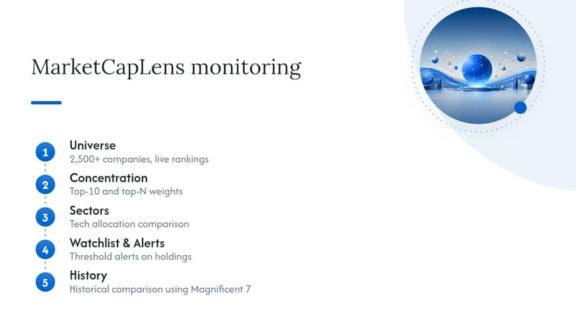
Marketcaplens tracks over 2,500 companies with rankings updated multiple times daily, giving you a direct view into top-10 and top-N weight without waiting on a quarterly report. You can compare sector allocations across technology, pull current market caps for names like Alphabet, and build a watchlist that flags when a single holding’s weight crosses a threshold you set. Pair that with historical data to see how today’s concentration stacks up against prior years, using the same Magnificent 7 framework many allocators already reference.
The bottom line on S&P 500 concentration
The right response isn’t panic or prediction. It’s ongoing, data-driven monitoring and modest structural adjustments where your mandate allows.
Our take: why we watch weight, not headlines
Most concentration commentary chases the next hot take on whether mega-caps are overvalued. Marketcaplens cares less about that debate and more about whether you can see the number itself, updated, sourced, and comparable to history. That’s the actual job: give investors and analysts a clear, current read on top holdings so allocation decisions rest on data rather than a headline’s mood. Use the platform’s rankings and historical charts to track your own top-10 exposure the same way you’d track any other risk factor, on a schedule, not a whim.
— MarketCapLens
This article is general information, not a substitute for advice from a qualified financial advisor. Consult a qualified financial professional about your own circumstances before acting on anything here.
Sources
- The S&P 500 Concentration Problem: When Index Investing Becomes A Bet On 10 Stocks — Forbes
- The ‘Great Narrowing’: S&P 500 concentration — RBC Wealth Management
- The Concentration Game — D. E. Shaw
- S&P 500 index methodology and sector breakdown — S&P Global
Recommended
For informational purposes only and is not investment advice. Do not rely on the facts, figures, ticker symbols, or other statements in this article — they may be incomplete, outdated, or incorrect, and we are not responsible for errors. See our disclaimer.